HTML CSS
- HTML is the Skeleton of body
- CSS is the flesh of the body.
- css 대신 scss를 사용하면 알아서 코드를 연결시켜주는 기능이 있다.
- HTML 과 CSS로 일을 할 때, 처음 필요한 것은 디자인 mock up이다.
- top down으로 생각하는 것이다.
-div태그는 레이아웃의 구조를 정의내리기 위해서 있다고 생각할 수 있다.
- 파일탐색기에 표시를 눌러서 이미지 폴더를 가져올 수 있다.
img {
    width: 100%;
}
- 이렇게 하면 브라우저 크기에 맞게 조절된다.
- html을 구성할 때는 이렇게 블록의 형태로 생각하면 쉽다.
- span 태그는 같은 문장 사이에서 추후 스타일 구분을 해줄 때 좋다.
- 로고와 메뉴를 넣었을 때 모바일로 넘어가면 넓이가 부족해 겹쳐보일 수 있어서 모바일일 때는 모바일 카테고리 형식으로 나타날 수 있어야 한다.
- ul unordered list의 약자이다.
- vscode의 복사붙혀넣기 단축키는 alt + shift + 방향키다.
- svg 파일은 벡터 그래픽의 코드형식이다.
https://fonts.google.com/specimen/Poppins?query=poppins
Google Fonts
Making the web more beautiful, fast, and open through great typography
fonts.google.com
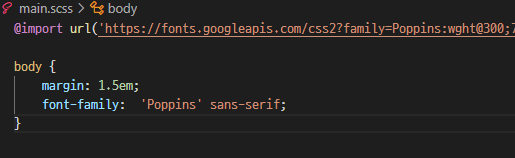
- 폰트는 원래 그것을 가지고 있는 사람들만 보여지는 것이기 때문에 자신이 보여지길 원하는 폰트가 상대방에게 없을 경우 대체할 수 있는 폰트를 넣어줘야 하고, 강제로 그 폰트로 보여지도록 하기 위해서는 import를 해줘야 한다.
- 혹은 html 문서에 링크를 넣어주어야 하는데 이 방법이 더 자주 쓰인다.
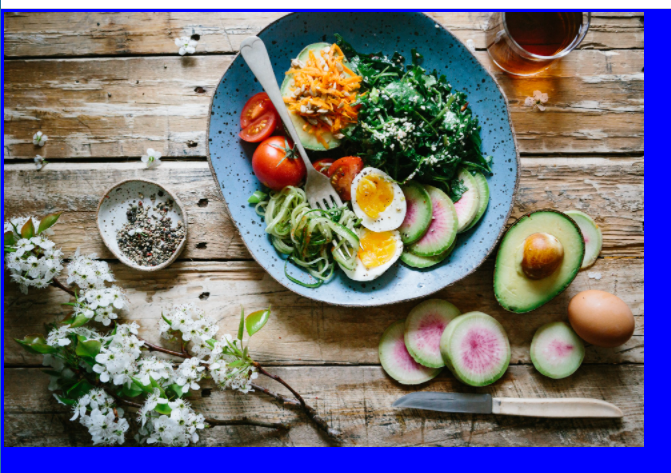
- 백그라운드를 이미지로 넣고 싶을 때는 이미지를 링크로 넣어주면 된다.
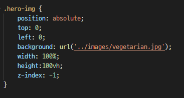
- z-index -1은 최하위 레이어를 의미한다.
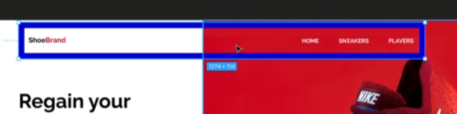
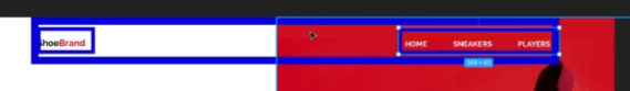
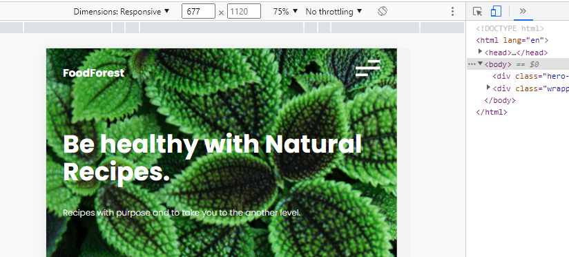
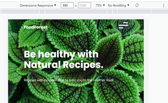
- 이 영역이 헤더 영역이라고 할 수 있는데, 여기가 오른쪽 이미지처럼 위아래가 아닌 양옆에 있게 하기 위해서는 칼럼이 두개가 있어야 하는 것을 알 수 있다.
- display flex로 양옆으로 나눠지는 것을 볼 수 있다. 그리고 justify-space between 으로 양옆으로 밀려난다. flex 대신 grid를 사용할 수도 있다.
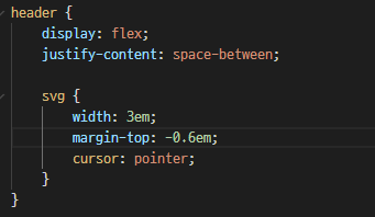
- 위 이미지에서 보이는 것이 사스(Scss)의 기능 중 하나이다. 네스팅 nesting이라고 하는데, svg가 다른 곳에 또 있다고 하더라도, header안에 있는 svg에만 css를 적용시킬 수 있는 기능이다.
// 최소 680px 이 되는 스크린에 대해서만 아래 ruleset이 적용된다.
// 현재는 모바일 first 디자인이기 때문에 min으로 하고
// 데스크탑 first일 경우는 이것이 max가 된다.
@media only screen and (min-width: 680px) {


}
차이 확인하기
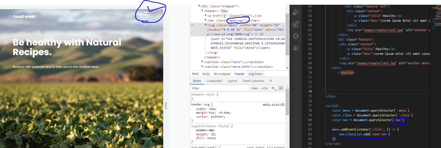
- 메뉴를 눌렀을 때 나오는 것이 없으므로, 클릭했을 때 작동할 수 있는 코드를 자바스크립트를 통해 짠다.
- 클릭했을 때 작동하는 클라스를 생성하여 위와 같이 클릭하면 open-nav가 나오는 것을 볼 수 있다.
nav {
   	position: fixed;
   	right: 0;
    top: 0;
    background: white;
    height: 100vh;
    width: 50%; // 화면의 절반
    z-index: 999; // 항상 위에 있게 하기 위해서
    text-transform: uppercase;
    transform: translateX(100%); // 현재 보이지 않게 만든 이 상태에 있는 것을
    transition: transform .5s ease-in-out;   // 사용자가 어떤 행동을 함으로써 javascript를 이용해 0%로 만든다.
- css 위에 nav에서 translateX(100%)로 해두어 메뉴바가 보이지 않게 해두었었는데,
.open-nav {
    transform: translateX(0%)
}
- 이것을 다시 보이게 하기 위해서는 translateX(0%)로 만들어줘야 하는데 이것을 아까 만들어둔 자바스크립트와 css가 연동해서 작동하도록 한다.
결과값
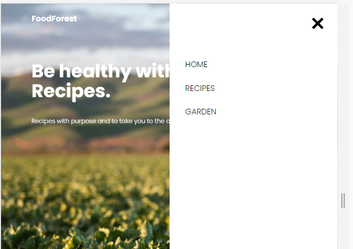
- 메뉴바를 클릭하는 것으로 다시 보이게 된 것이다.
   <script>
        const menu = document.querySelector('.menu')
        const close = document.querySelector('.close')
        const nav = document.querySelector('nav')

        menu.addEventListener('click', () => {
            nav.classList.add('open-nav') // 메뉴 버튼 눌렀을 때 클래스 생성
        })

        close.addEventListener('click', () => {
            nav.classList.remove('open-nav') // 클로즈버튼을 눌렀을 때 클래스 삭제
        })

    </script>
- 이렇게 하므로써 어트리뷰트가 사라지면서 메뉴창이 사라지는 것을 확인할 수 있다.
최종 html css
<!DOCTYPE html>
<html lang="en">
<head>
<meta charset="UTF-8">
<meta http-equiv="X-UA-Compatible" content="IE=edge">
<meta name="viewport" content="width=device-width, initial-scale=1.0">
<title>MyFirstWebsite</title>
<link rel="preconnect" href="https://fonts.googleapis.com">
<link rel="preconnect" href="https://fonts.gstatic.com" crossorigin>
<link href="https://fonts.googleapis.com/css2?family=Poppins:wght@300;700&display=swap" rel="stylesheet">
<link rel="stylesheet" href="css/main.css">
</head>
<body>
<div class="hero-img"></div>
<div class="wrapper">
<header>
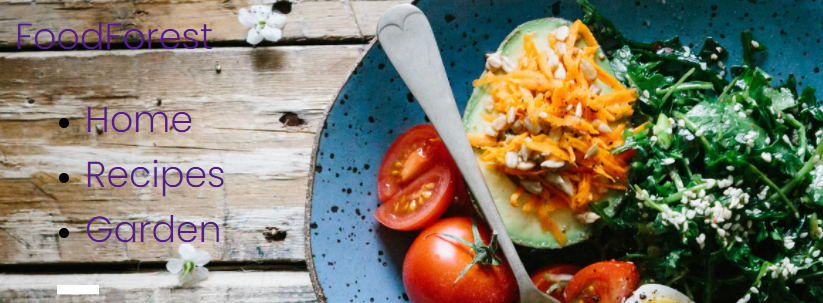
<a href="#" class="logo">Food<span>Forest</span></a>
<nav>
<svg class="close" viewBox="0 0 30 30" style=" fill:#000000;">
<path d="M 7 4 C 6.744125 4 6.4879687 4.0974687 6.2929688 4.2929688 L 4.2929688 6.2929688 C 3.9019687 6.6839688 3.9019687 7.3170313 4.2929688 7.7070312 L 11.585938 15 L 4.2929688 22.292969 C 3.9019687 22.683969 3.9019687 23.317031 4.2929688 23.707031 L 6.2929688 25.707031 C 6.6839688 26.098031 7.3170313 26.098031 7.7070312 25.707031 L 15 18.414062 L 22.292969 25.707031 C 22.682969 26.098031 23.317031 26.098031 23.707031 25.707031 L 25.707031 23.707031 C 26.098031 23.316031 26.098031 22.682969 25.707031 22.292969 L 18.414062 15 L 25.707031 7.7070312 C 26.098031 7.3170312 26.098031 6.6829688 25.707031 6.2929688 L 23.707031 4.2929688 C 23.316031 3.9019687 22.682969 3.9019687 22.292969 4.2929688 L 15 11.585938 L 7.7070312 4.2929688 C 7.5115312 4.0974687 7.255875 4 7 4 z"></path>
</svg>
<ul>
<li><a href="#">Home</a></li>
<li><a href="#">Recipes</a></li>
<li><a href="#">Gardening</a></li>
<li><a href="#">Login</a></li>
</ul>
</nav>
<svg class="menu" width="48" height="32" viewBox="0 0 48 32" fill="none" xmlns="http://www.w3.org/2000/svg">
<path d="M24 32H0V26.6667H24V32ZM48 18.6667H0V13.3333H48V18.6667ZM48 5.33333H24V0H48V5.33333Z" fill="white"/>
</svg>
</header>
<section class="hero">
<h1>Be healthy with Natural Recipes.</h1>
<p class="subhead">Recipes with purpose and to take you to the another level.</p>
<svg class="down-arrow" width="16" height="132" viewBox="0 0 16 132" fill="none" xmlns="http://www.w3.org/2000/svg">
<path d="M7.29289 131.707C7.68341 132.098 8.31658 132.098 8.7071 131.707L15.0711 125.343C15.4616 124.953 15.4616 124.319 15.0711 123.929C14.6805 123.538 14.0474 123.538 13.6568 123.929L7.99999 129.586L2.34314 123.929C1.95262 123.538 1.31945 123.538 0.928927 123.929C0.538402 124.319 0.538402 124.953 0.928927 125.343L7.29289 131.707ZM7 -4.37114e-08L6.99999 131L8.99999 131L9 4.37114e-08L7 -4.37114e-08Z" fill="black"/>
</svg>
</section>
<section class="more-info">
<div class="feature">
<div class="content">
<p class="title">Healthy</p>
<p class="desc">Lorem ipsum dolor sit amet consectetur adipisicing elit. Sunt quas aliquam, placeat necessitatibus aliquid facilis atque explicabo rem? Commodi nulla saepe perspiciatis qui, autem praesentium cum doloribus eum illo sunt.</p>
</div>
<img src="images/vegetarian1.jpg" alt="another photo">
</div>
<div class="feature left">
<div class="content">
<p class="title">Healthy</p>
<p class="desc">Lorem ipsum dolor sit amet consectetur adipisicing elit. Sunt quas aliquam, placeat necessitatibus aliquid facilis atque explicabo rem? Commodi nulla saepe perspiciatis qui, autem praesentium cum doloribus eum illo sunt.</p>
</div>
<img src="images/vegetarian2.jpg" alt="another photo">
</div>
<div class="feature">
<div class="content">
<p class="title">Healthy</p>
<p class="desc">Lorem ipsum dolor sit amet consectetur adipisicing elit. Sunt quas aliquam, placeat necessitatibus aliquid facilis atque explicabo rem? Commodi nulla saepe perspiciatis qui, autem praesentium cum doloribus eum illo sunt.</p>
</div>
<img src="images/vegetarian3.jpg" alt="another photo">
</div>
</section>
</div>
<script>
const menu = document.querySelector('.menu')
const close = document.querySelector('.close')
const nav = document.querySelector('nav')
menu.addEventListener('click', () => {
nav.classList.add('open-nav') // 메뉴 버튼 눌렀을 때 클래스 생성
})
close.addEventListener('click', () => {
nav.classList.remove('open-nav') // 클로즈버튼을 눌렀을 때 클래스 삭제
})
</script>
</body>
</html>body {
margin: 3em;
font-family: 'Poppins', sans-serif;
}
a {
text-decoration: none;
font-size: 1.3rem;
}
.hero-img {
position: absolute;
top: 0;
left: 0;
background: url('../images/vegetarian.jpg');
background-size: cover;
background-position-x: 20%;
background-position-y: 20%;
width: 100%;
height:100vh;
z-index: -1;
animation: introLoad 2s forwards; // repeat하고 싶지 않기 때문
// overflow: hidden;
}
.logo {
color: white;
font-weight: bold;
}
nav {
position: fixed;
right: 0;
top: 0;
background: white;
height: 100vh;
width: 50%; // 화면의 절반
z-index: 999; // 항상 위에 있게 하기 위해서
text-transform: uppercase;
transform: translateX(100%); // 현재 보이지 않게 만든 이 상태에 있는 것을
transition: transform .5s ease-in-out; // 사용자가 어떤 행동을 함으로써 javascript를 이용해 0%로 만든다.
ul {
list-style-type: none;
padding: 0; // 글자를 좌측으로 항상 밀어줌
margin-top: 8em; // 석삼자 메뉴가 위에 있어야 하기 때문
a {
color: black;
padding: 0.75em 2em;
display: block;
width: 100%;
&:hover { // 마우스 커서를 놓으면
background: rgb(236, 236, 236);
}
}
}
.close { // 메뉴의 클로즈 버튼
float: right;
margin: 2em;
width: 2.5em;
}
}
header {
display: flex;
justify-content: space-between;
svg {
width: 2.3em;
margin-top: -0.6em;
cursor: pointer;
}
}
h1 {
font-size: 3rem;
margin-top: 2em;
line-height: 3.3rem;
}
section.hero {
color: white;
font-size: 1.2em;
height: 90vh;
animation: moveDown 1s ease-in-out forwards;
opacity: 0; // 애니매이션 초기값
.down-arrow { // 화살표
stroke: white;
position: absolute;
bottom: 2em;
width: 1em;
animation: moveArrow 1s alternate-reverse infinite; // backandforth infinite
margin-top: 2em;
margin-bottom: 2em;
path {
fill: white;
}
}
}
.more-info {
img {
width: 100%; // responsive하는 것
object-fit: cover; // 이게 없으면 이미지가 왜곡된다.
height: 11em; // 크기 설정
}
.title {
font-weight: bold;
font-size: 1.25rem;
}
.desc {
line-height: 1.5rem;
}
}
.open-nav {
transform: translateX(0%)
}
// 680px 아래가 되는 스크린에 대해서만 아래 ruleset이 적용된다. : 모바일
// 현재는 모바일 first 디자인이기 때문에 min으로 하고
// 데스크탑 first일 경우는 이것이 max가 된다.
// @ 오버라이딩 개념이다.
@media only screen and (min-width: 680px) {
body {
margin: 1.5em 5em; // 이미지 겹칠 때 조정
font-family: 'Poppins', sans-serif;
}
}
// 아래의 경우는 920px이 넘어갈 경우 : 데스크탑
// 메뉴를 없애는 기능이다.
@media only screen and (min-width: 920px) {
.menu {
display: none;
}
nav {
transform: translateX(0);
position: unset;
display: block;
height: auto;
background: none;
svg.close {
display: none;
}
ul {
display: flex; // column형태로 만들기
margin: 0; // 위에서 정의내렸던 위 여백 없애기
a {
color: white;
padding: .5em 1.5em;
font-size: .9em;
&:hover {
background: none;
text-decoration: underline;
}
}
}
}
.hero-img {
left: unset;
right: 0;
width: 50%;
height: 42em;
}
.logo{
color: black;
span {
color: rgb(0, 197, 49);
}
}
section.hero {
color: black;
height: auto;
width: 40%;
margin-bottom: 8em;
svg.down-arrow {
stroke: black;
position: unset;
path {
fill:black;
}
}
}
.feature {
display: grid; // 박스형태로 다룰 것이기 때문에
grid-template-columns: repeat(2, auto); // 행을 두 개로 하고, auto는 열을 자동
gap: 3em;
margin-bottom: 8em;
img {
width: 25em;
}
.content {
text-align: right;
width:25em;
}
}
.feature.left {
grid-template-areas:
"left right";
img {
grid-area: left;
}
.content {
text-align: left;
width: 25em;
justify-self: left;
}
}
}
// 화면이 1200px 이상으로 늘어나더라도 더 이상 늘어나지 않도록 고정
@media only screen and (min-width: 1200px) {
.wrapper {
width: 1200px;
margin: 0 auto; // centering
}
.feature {
gap: 0; // 칼럼사이 갭?
}
}
// 키프레임 애니메이션 정의하는 법
@keyframes introLoad {
from { // 애니메이션 from to
clip-path: polygon(0 0, 100% 0%, 100% 0, 0 0); // https://bennettfeely.com/clippy/
}
to {
clip-path: polygon(0 0, 100% 0, 100% 100%, 0 100%);
}
}
@keyframes moveArrow {
from { // 애니메이션 from to
transform: translateY(-30px);
}
to {
transform: translateY(0);
}
}
@keyframes moveDown {
from { // 애니메이션 from to
transform: translateY(-100px);
}
to {
transform: translateY(0);
opacity: 1;
}
}'Programming > HTMLCSS' 카테고리의 다른 글
| Foodforest 홈페이지 및 로그인 페이지 (0) | 2022.04.25 |
|---|---|
| Xml 파일이란 무엇인가? (0) | 2022.04.21 |
| HTML CSS 연습 (0) | 2022.03.17 |
| 티스토리에 TOC(Table of Contents) 목차 만들기 (1) | 2021.12.29 |
| 티스토리 단축키 (0) | 2021.12.29 |

